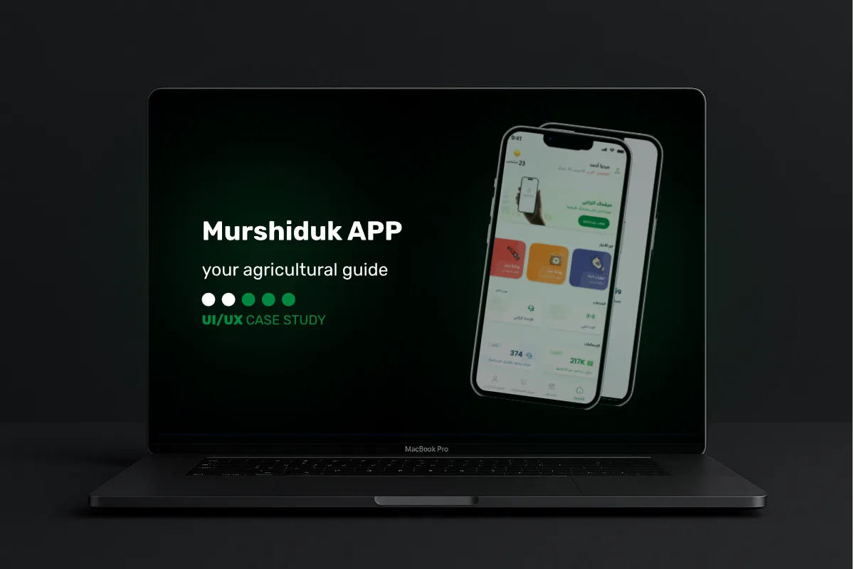
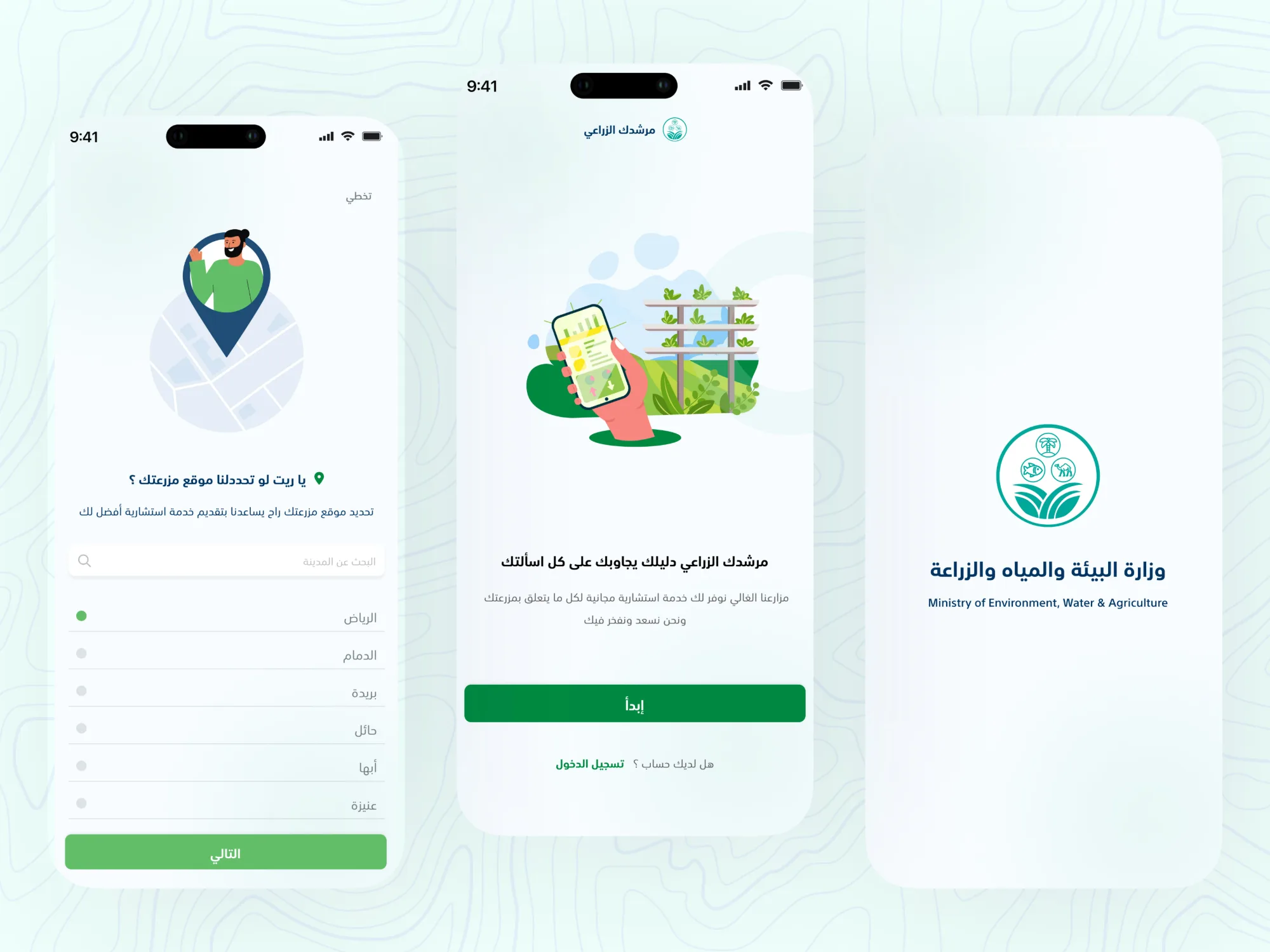
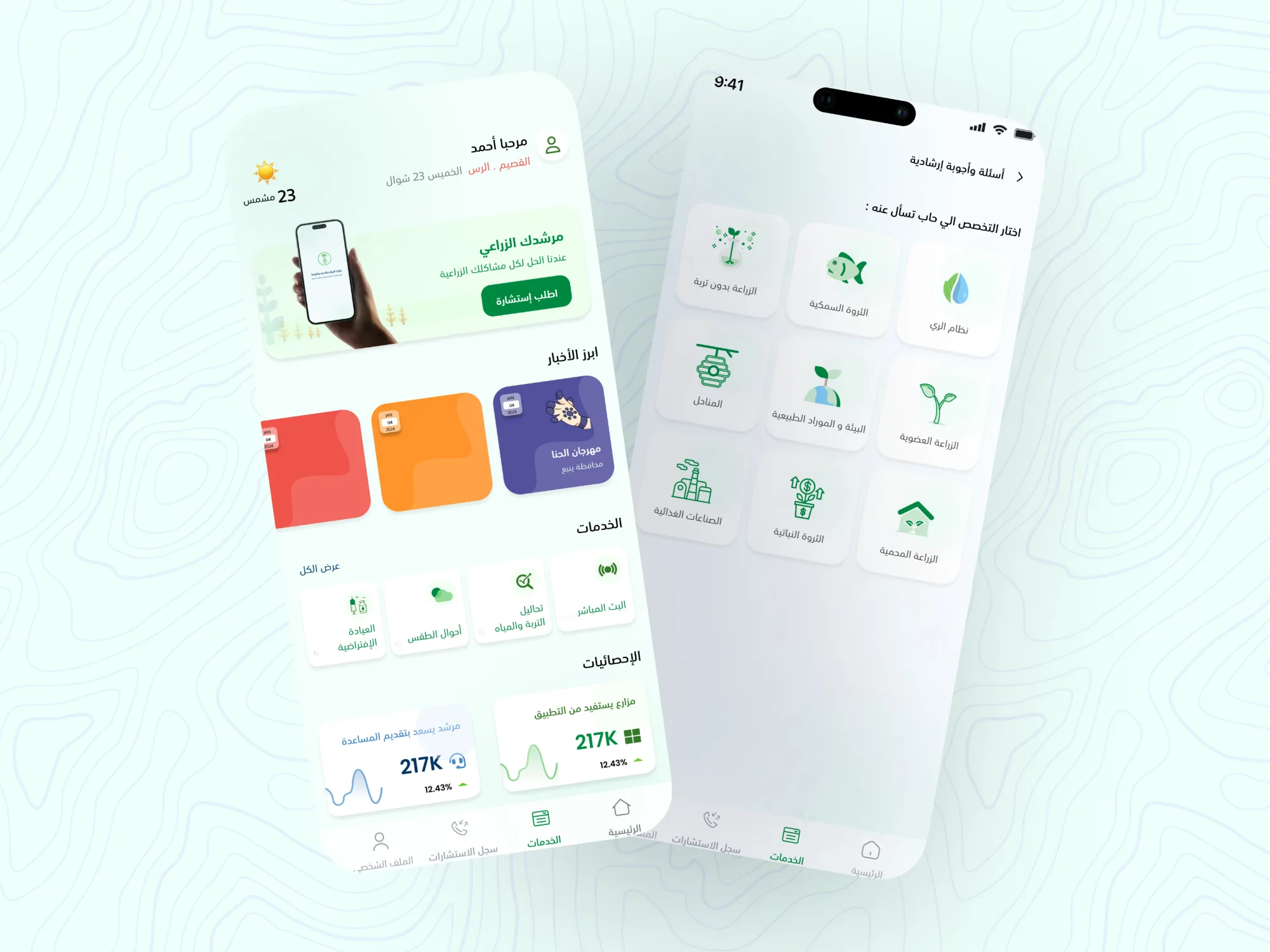
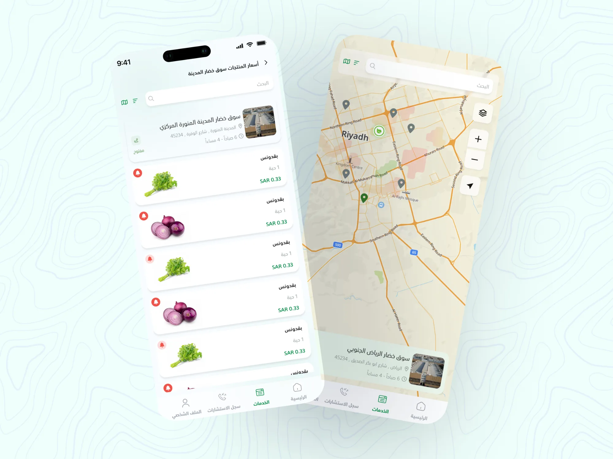
The redesign of the Murshiduk Agricultural Guide App followed a user-centered and iterative design process. Each stage was carefully structured to ensure the app addressed real farmer needs, aligned with the Ministry’s identity, and provided a seamless, modern experience
01Discovery & Research
The first step was understanding the context and users.
- Stakeholder Alignment Met with representatives from the Ministry of Environment, Water, and Agriculture to clarify project objectives and service priorities.
- User Personas Defined different types of farmers (small-scale, large-scale, seasonal, etc.) and their digital literacy levels.
- Competitor Benchmarking Studied both local and international agricultural apps to identify usability best practices.
- Existing App Review Identified critical UX flaws such as inconsistent navigation, overloaded screens, and lack of accessibility.
Outcome
A clear picture of what farmers need most: quick access to weather, trusted guidance, and simple service requests.
02Define & Problem Framing
From research, I mapped the current user journey and highlighted pain points:
- Too many clicks to reach basic services.
- Inconsistent language and iconography confusing users.
- No clear hierarchy farmers had to “search” for important features like pest inquiry or market prices.
UX Design Principles were defined to guide the redesign:
- Clarity Simple navigation and visual hierarchy.
- Consistency Unified layouts, typography, and icon usage.
- Accessibility Design for varied literacy and device familiarity.
- Trust A clean, official look aligned with government branding.
03Ideation & Wireframing
With problems defined, I began exploring solutions.
- Information Architecture Reorganized the app into logical categories (e.g., Smart Guidance, Weather, Market Prices, Lab Services).
- Low-Fidelity Wireframes Sketched different layouts for dashboards, forms, and service flows.
- User Flow Redesign Optimized common tasks, submitting a lab sample request was reduced from 6 steps to 3.
- Stakeholder Reviews Presented wireframes in iterative sessions to ensure alignment with the Ministry’s vision.
Outcome
A validated structure that felt simpler and more intuitive.
04Visual Design
Once the flow was approved, I moved into creating the visual language.
- Brand Alignment Applied the Ministry’s identity guidelines while modernizing the look with clean layouts and a balanced color system.
- Iconography Designed clear, farmer-friendly icons for services like weather, crops, and pests.
- Typography & Hierarchy Used font weights and spacing to create clear separation between key actions and secondary information.
- Accessibility Considerations Ensured sufficient contrast, scalable text, and touch-friendly button sizes.
Outcome
A design that balanced government credibility with modern usability.
05Prototyping & Usability Testing
- High-Fidelity Prototypes Created interactive prototypes simulating real use cases.
- User Testing Conducted usability sessions with farmers to test key flows (weather updates, pest guidance, submitting inquiries).
- Feedback Analysis Farmers reported improved clarity and faster navigation. Adjustments included larger buttons, simplified labels, and restructured dashboards.
Outcome
Validation that the new design solved pain points while remaining easy to use.
06Iteration & Final Delivery
The final stage focused on ensuring scalability and smooth developer handoff.
- Design System Creation Built a modular system of reusable components (buttons, cards, forms) to maintain consistency across future services.
- Documentation Provided developers with specs and interaction guidelines.
- Collaboration Worked closely with the dev team to ensure that the final product preserved the design intent.
Outcome
A scalable, future proof platform that can grow with new services without sacrificing UX quality.