Analysis & Research
Given the scale, the first step was to analyze the platform and understand the business side:
- Service Audit Reviewed existing services, their flows, and differences in design and implementation.
- Stakeholder Interviews Met with multiple business owners to identify their needs and constraints.
- Pain Point Collection Analyzed user feedback and support tickets to highlight recurring issues such as:
- Inconsistent navigation patterns across services.
- Different UI elements and terminologies creating confusion.
- Redundant form structures that slowed down completion.
- Lack of accessibility standards across services.
Outcome
A clear understanding that inconsistency was the biggest barrier to usability and efficiency.
Persona Development
To ensure user needs guided the redesign, we developed personas representing the platform’s diverse audience:
- Citizens seeking permits, licenses, or submitting reports.
- Business Owners applying for commercial approvals or certificates.
- Municipal Employees reviewing and approving applications.
- Consultants/Contractors submitting technical documents.
These personas helped prioritize simplicity, trust, and efficiency as core design principles.
Crafting the Design System
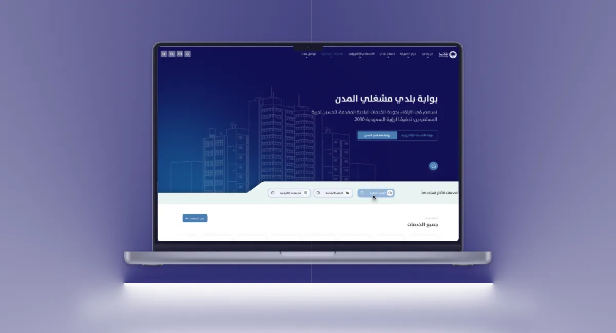
The biggest challenge and opportunity was creating a Design System that could unify 400+ services.
Key Principles
- Consistency Every service should feel like part of Balady, regardless of the team managing it.
- Scalability The system should support new services without reinventing the design.
- Efficiency Reusable components should speed up design and development.
- Accessibility All services must be usable by citizens with different levels of digital literacy.
Components & Patterns
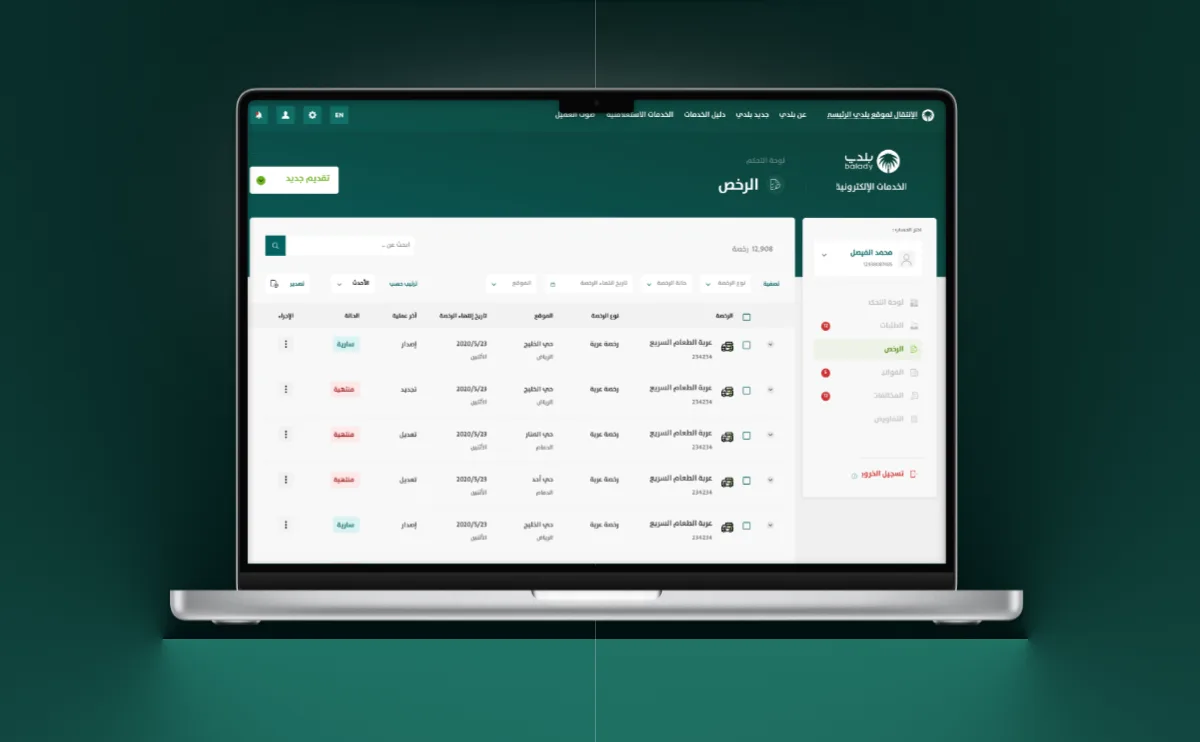
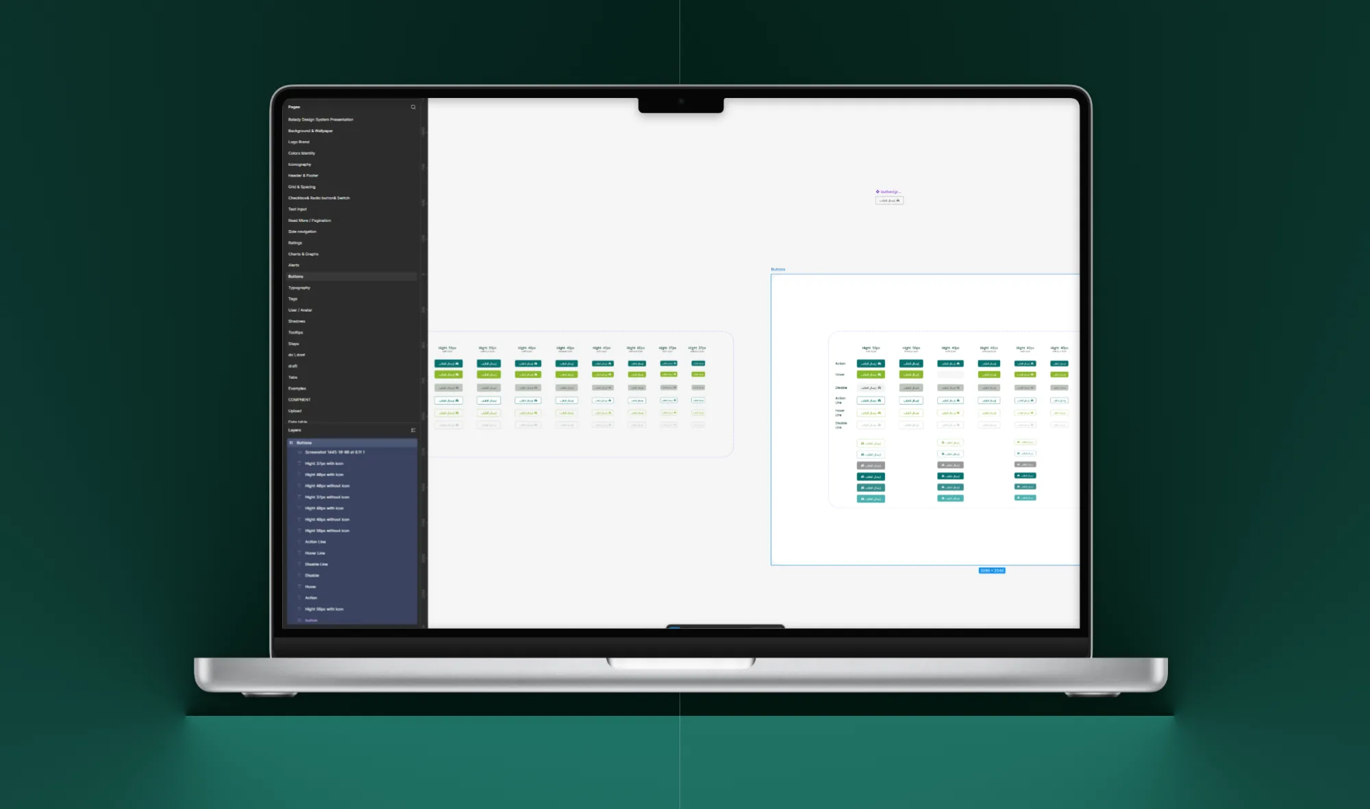
- UI Library Buttons, inputs, dropdowns, progress bars, alerts, and tables designed once and reused everywhere.
- Form Templates Standardized form structures for applications, reducing errors and speeding up submissions.
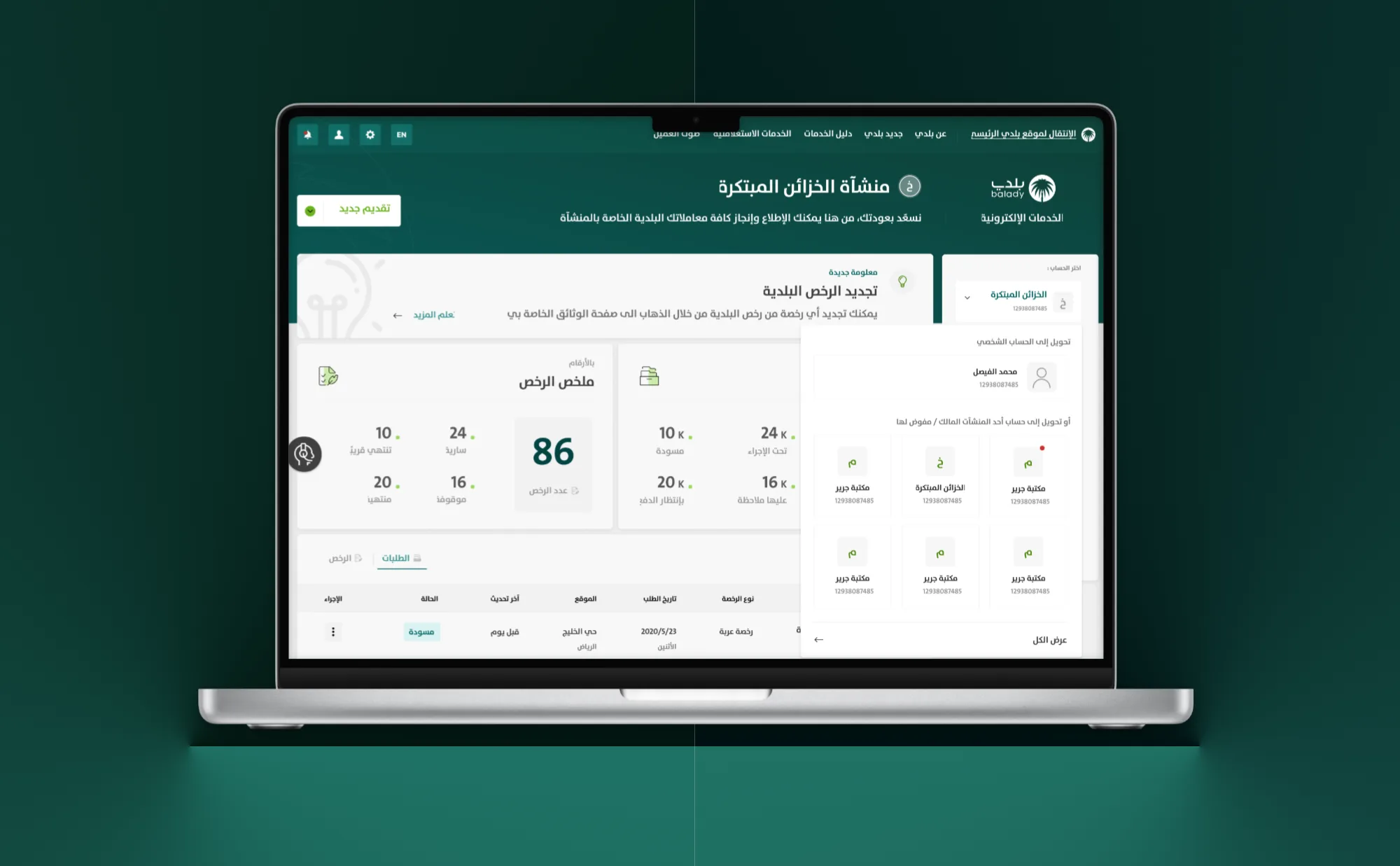
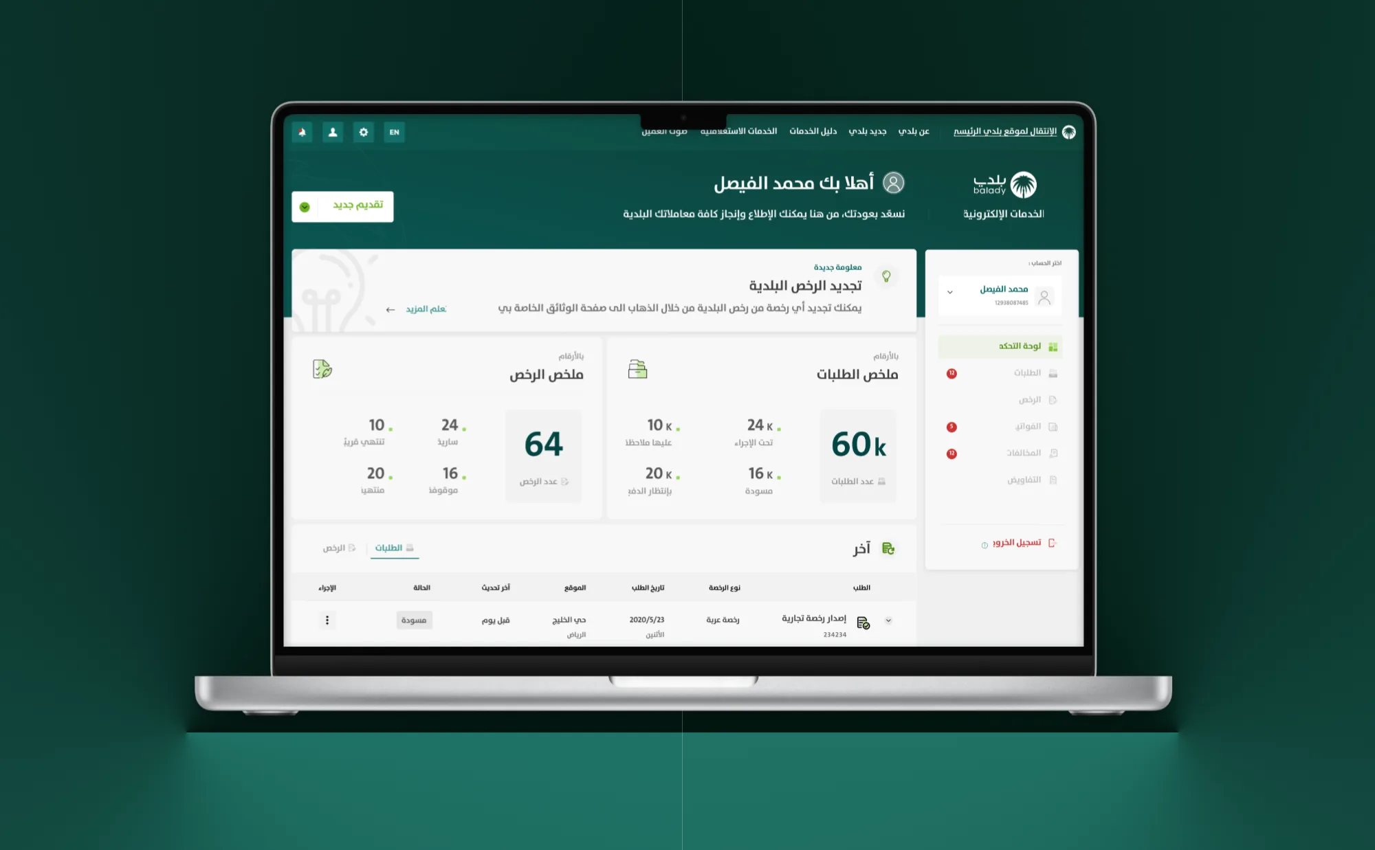
- Navigation Patterns Clear, predictable menu and service flows across all services.
- Status Tracking Widgets Unified way for users to follow their application progress.
- Color & Typography System Modern, accessible palette aligned with MOMRAH’s identity.
Documentation & Handoff
- Created design documentation to guide developers and business owners.
- Built a Figma component library with usage guidelines for each element.
- Established a governance model to maintain consistency across teams.
Impact
Instead of redesigning each service separately, business owners could now plug into the design system, ensuring both speed and consistency.
Testing & Iteration
Each redesigned service went through usability testing, focusing on:
- Form Completion Rates Were users able to complete services faster?
- Error Reduction Did inline validation prevent mistakes?
- Navigation Clarity Could users easily find their service and track its status?
Feedback led to refinements like shorter labels, clearer error messages, and larger touch areas for mobile users.